
YAVACADO turned our technical equipment catalog into a clear, professional website that our team can manage. The CMS and CRM integration make it easier to present products, process enquiries, and support clinics from the first contact.
4
min to read
Web Design Trends: How to Choose What Actually Helps Your Website
Web design
Educational
Explore all
April 18, 2024
Assess motion, expressive layouts, AI-generated concepts and modular design through the tasks your visitors and editors need to complete.
In this article
Updated 12 September 2026.
In this guide
- Give every visual technique a job.
- Test expressive design with real content and small screens.
- Plan how the design will behave when new content arrives.
Replace trend lists with a design brief
A fashionable layout is only useful if it serves the business and its audience. Before collecting references, define the page’s job: demonstrate a creative portfolio, help buyers compare services or make a complicated offer easier to understand.
Build a short reference board with a note under each example explaining what you want to learn from it. “The work is easy to browse” is more actionable than “this feels premium”. The brief should explain which visitor problem a technique will solve.
Use motion to explain or demonstrate
Motion can reveal a product interaction, connect interface states or show the quality of a studio’s work. It becomes less useful when every scroll triggers a new effect before the visitor can read the content.
For a video production business, showreels may be essential evidence. Even then, provide a clear path through the page when video has not loaded, and avoid making the main action depend on a long animation. Agree on a reduced-motion treatment and test keyboard navigation alongside the visual experience.
A practical filter for design trendsTechniqueUseful whenTest before approvalScroll animationIt demonstrates a processReading order and reduced motionLarge typographyIt clarifies the messageLong titles and narrow screensVideo heroThe work needs to be seen in motionLoading and a usable fallbackModular sectionsThe team publishes regularlyMissing and unusually long contentAI-generated conceptsYou need to explore visual directionsReal content, structure and responsive behaviour
Make expressive typography survive real content
Large headings and unusual compositions need testing beyond the approved design mockup. Replace the headline with a longer service name, then view it on a narrow screen. Add a translated paragraph and see whether the layout still makes sense.
Use a restrained set of text styles with clear roles. A small distinction between label, body and heading often creates more useful hierarchy than a different font treatment in every section. Keep important information as selectable text instead of baking it into an image.
Practical takeaway: Approve a design technique because it helps someone do something.
Turn repeated layouts into an editorial system
Consider what the website will contain six months after launch. New projects, services and team members should fit into a known structure. Design the empty, short and long versions of each recurring card before turning it into a template.
The goal is controlled flexibility. Editors should be able to select a relevant layout and supply the content without rebuilding spacing and typography. If a new case study always requires custom design work, the library may be attractive but difficult to maintain.
Treat AI concepts as material to evaluate
An AI-generated visual can help explore mood, hierarchy or composition. It does not establish a complete interaction model, a content strategy or a reliable responsive layout. Check the concept against a real page before investing in production.
For each proposed trend, make a small working example and ask three questions: does it clarify the offer, can the intended audience use it, and can the team maintain it? Keep the techniques that pass. A coherent set of decisions will age better than a page assembled from unrelated effects.
A related YAVACADO project
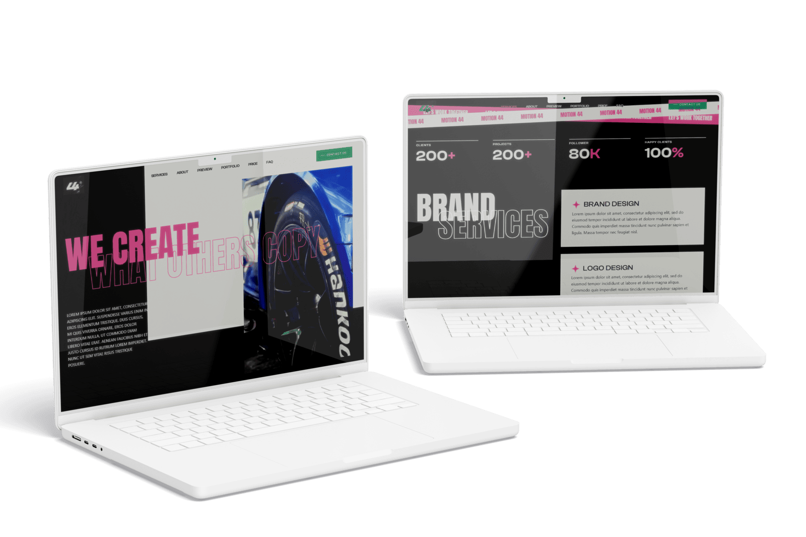
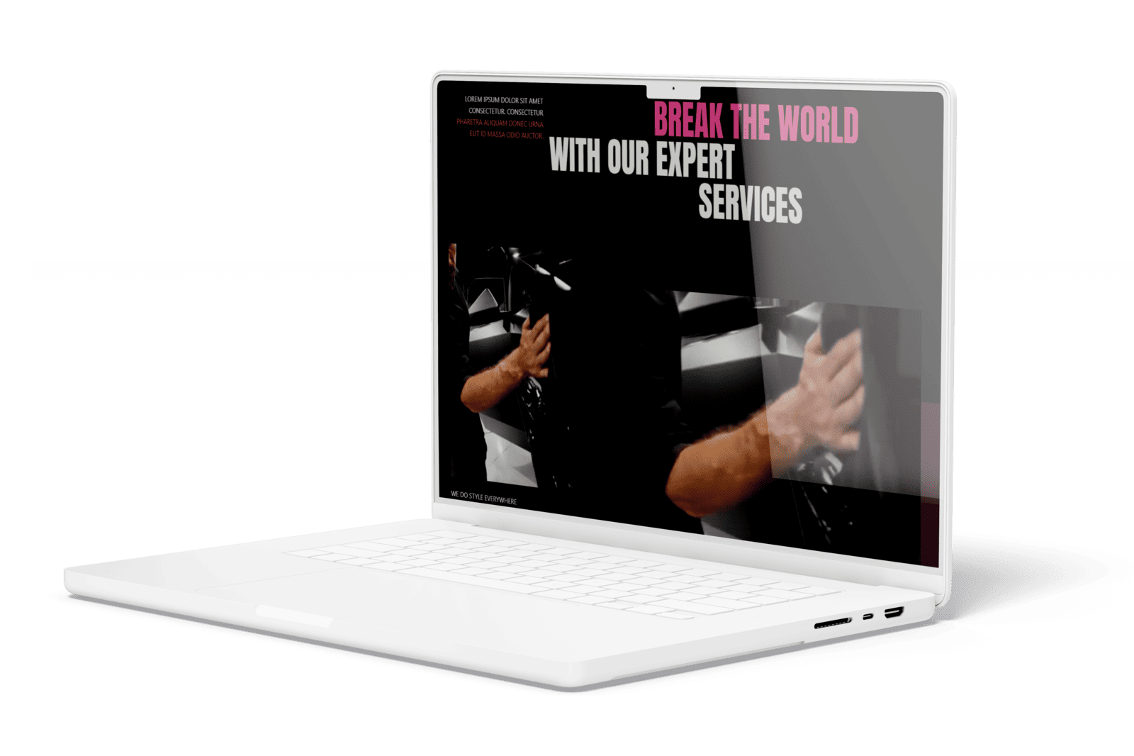
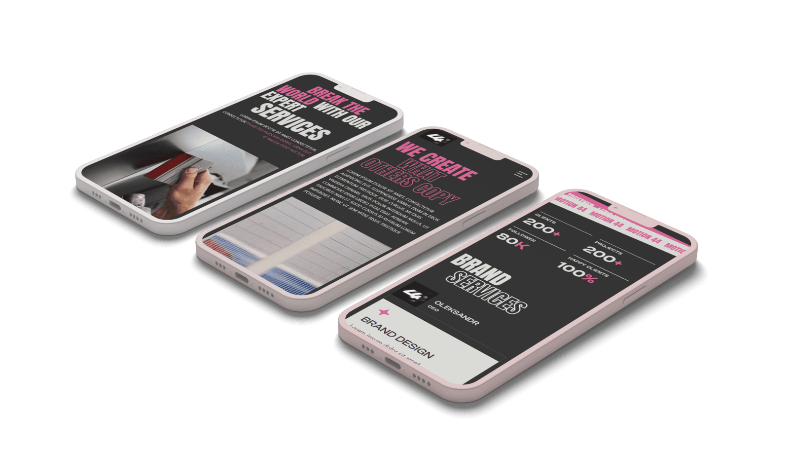
For 44 Motion, YAVACADO developed a street-style visual direction and built the website in Webflow using Client-First. Custom transitions supported a portfolio centred on film and animation. Motion was connected to the studio’s offer and work, rather than added as a generic decoration.
The YAVACADO understood our vision perfectly and was quick to make any adjustments we needed, ensuring the final product met all our expectations.
Client feedback from 44 motion.
Your next check
Mark each item as you check it. Ticks last for this page visit.
Give each animation a purpose.Test the longest heading on mobile.Check a page with missing optional content.Define how the next project will be published.
Put it into practice
Evaluate one reference
Choose your favourite reference and describe its useful behaviour without using aesthetic adjectives. If you cannot, keep exploring before committing to that treatment.
Continue with a related guide
- Website First Impressions: Design for Clarity, Trust and the Next Step
- From AI Website Concept to Production: What Still Needs to Be Built
Discuss your website
Turn your design references into a website your visitors and team can use.
Explore our Figma and Webflow design service or tell us about your project.
FAQs
Does the website need a full redesign to feel current?
Should all websites use animation?
How do we keep a distinctive design maintainable?
Local SEO: Build a Website That Turns Nearby Searches into Enquiries
8/16/23
4
min to read
Website Enquiry Forms: Ask Better Questions and Reduce Friction
12/15/25
4
min to read
WordPress to Webflow Migration: Build the URL Map Before Launch
12/29/25
4
min to read
Webflow MCP: Choose Your First AI Agent Task for the CMS
9/24/26
6
min to read
Relevant project
Corporate Website for a Video Production Studio
We offer services that can help businesses improve their visibility and business reputation
Other
We designed and developed the corporate website for 44 Motion, a studio producing video and animation for SaaS brands. A street-style Figma concept was built in Webflow on Client-First, with custom animations and video that loads without slowing the page.
44 motion
Testimonials
What our clients say
A web design agency that cares about you and your brand, no matter the size or what industry your business is in.


YAVACADO turned a complex booking process into one clear platform. Our team can manage tours and content in Webflow, while parents can book and pay securely through WayForPay. The result is easy to operate and built around the needs of the Ukrainian market.

The website captures the premium feel of our brand perfectly. From the design to the multilingual functionality and payment integration, every detail was delivered to a very high standard.

Excellent implementation of our Figma design in Webflow. The final website feels fast, polished, and exactly aligned with the premium fintech experience we wanted.

The funnel feels significantly more polished than the original concepts and was delivered in a format our internal team could immediately continue working with. Smooth process and excellent execution.

Working with YAVACADO was a fantastic experience. They understood both the technical requirements and the business goals, delivering a fast, polished website that's easy to manage and built to generate qualified leads.

Impressive speed and quality. The landing page was delivered in just hours and looks clean, professional, and ready to use.

The turnaround was incredibly fast, and the result looks clean and professional. The site reflects our firm perfectly and was delivered exactly on time.