
YAVACADO turned our technical equipment catalog into a clear, professional website that our team can manage. The CMS and CRM integration make it easier to present products, process enquiries, and support clinics from the first contact.
4
min to read
Website First Impressions: Design for Clarity, Trust and the Next Step

Web design
Educational
Explore all
September 18, 2023
Review your homepage through a buyer’s eyes: explain the offer, show credible evidence and make the next action easy to understand.
In this article
Updated 12 September 2026.
In this guide
- Explain the offer before asking visitors to interpret the visuals.
- Place relevant proof close to the claim it supports.
- Use a clear next step with a realistic expectation of what happens afterward.
Write the first screen as an answer
Imagine a potential client opens your website from a referral. They may know the company name and little else. The first screen should help them identify the service, the intended customer and a useful next step.
“We build digital experiences” leaves a lot to interpretation. “Webflow websites for marketing teams that need to publish without a developer” is more specific, provided that is the service you actually deliver. The design can then reinforce the message with a relevant project rather than competing with it.
Build hierarchy before adding effects
Choose the order in which someone should notice the headline, supporting sentence, primary action and proof. Use type size, spacing and placement to establish that order. If everything moves or has the same visual weight, the visitor must decide what matters.
Keep the main paragraph readable over its background. Test long headlines, translated text and small screens before approving the composition. A striking desktop layout that hides the action below an oversized image may need a different mobile arrangement.
Replace vague presentation with useful evidencePage elementWeak versionStronger versionHeadlineA broad promiseService, audience and useful outcomePortfolioA wall of mockupsA relevant example with project contextTestimonialAn anonymous complimentAn attributed comment about the workPrimary buttonLearn moreA clear action and destinationFormA long qualification surveyEnough detail for the first useful reply
Make evidence specific
Pair each important claim with something a reader can inspect. A portfolio image should lead to an explanation of the work. A testimonial should name the client or organisation when permission allows. A delivery-time claim should explain its scope and starting point.
If a new business has few completed projects, show the process, a relevant demonstration or the people doing the work. Label concept work as concept work. Decorative client logos and unsupported growth percentages create an impression that the next conversation may not sustain.
Practical takeaway: The first screen should make the next decision easier.
Give the primary action a clear destination
Choose the action that matches the reader’s readiness. A person comparing agencies may want to see relevant work before filling out a project brief. Someone with a defined requirement may be ready to discuss scope immediately.
Use distinct labels such as “View Webflow projects” and “Discuss your website”. Avoid presenting several equally prominent buttons that all go to a generic contact form. On the form, explain what information you need and what the visitor receives after submitting it.
Review the page with people outside the project
Ask a few people unfamiliar with the business to describe the offer after viewing the first screen. Then ask them to find a relevant example and explain what would happen if they clicked the main button. Listen for confusion rather than defending the design.
Use the findings to change one meaningful problem at a time: an unclear headline, weak evidence or a difficult enquiry step. If you compare conversion data before and after, record traffic-source changes too. A different audience can change the numbers even when the design stays the same.
A related YAVACADO project
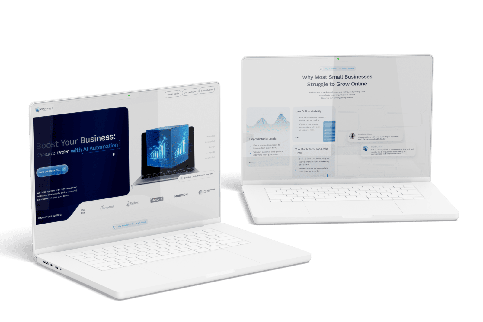
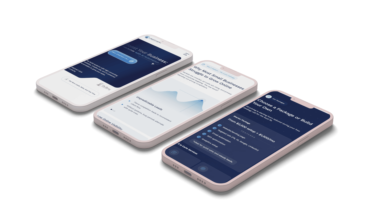
Craft Lions needed its first web presence. YAVACADO developed the content strategy alongside the design and built a modular Webflow site with portfolio CMS content. Planning message and structure together gave the new business a clearer way to introduce its offer and work.
Your next check
Mark each item as you check it. Ticks last for this page visit.
Can a new visitor describe the service?Does the first project support the main offer?Is the main action visible and understandable on mobile?Does the form explain the next step?
Put it into practice
Try a short homepage test
Ask someone who has not seen the site: “What does this company do, who is it for, and where would you go next?” Record their answers before explaining anything.
Continue with a related guide
- Web Design Trends: How to Choose What Actually Helps Your Website
- Why Use Webflow? Benefits, Trade-offs and a Practical Fit Check
Discuss your website
Build a homepage that explains your offer and gives visitors a clear next step.
Explore our Figma and Webflow design service or tell us about your project.
FAQs
Should every homepage have a large hero image?
Do animations improve conversion?
What should a new agency show without many case studies?
Campaign Landing Pages: Keep the Promise from Ad to Enquiry
12/8/25
4
min to read
The Future of Your Webflow Website: Plan for Change Without a Rebuild
11/4/24
4
min to read
How to Write a Website Redesign Brief That Prevents Rework
11/10/25
4
min to read
Webflow Variable Modes: Create a Theme You Can Maintain
1/15/25
4
min to read
Relevant project
Startup Landing Page Design and Webflow Build
We offer services that can help businesses improve their visibility and business reputation
Tech
We designed and developed a landing page for Craft Lions, a newly launched studio that builds sales systems for experts and course creators. The project covered content strategy, UI/UX design, a modular Webflow build on Client-First and SEO setup.
Craft Lions

Testimonials
What our clients say
A web design agency that cares about you and your brand, no matter the size or what industry your business is in.

YAVACADO turned a complex booking process into one clear platform. Our team can manage tours and content in Webflow, while parents can book and pay securely through WayForPay. The result is easy to operate and built around the needs of the Ukrainian market.

The website captures the premium feel of our brand perfectly. From the design to the multilingual functionality and payment integration, every detail was delivered to a very high standard.

Excellent implementation of our Figma design in Webflow. The final website feels fast, polished, and exactly aligned with the premium fintech experience we wanted.

The funnel feels significantly more polished than the original concepts and was delivered in a format our internal team could immediately continue working with. Smooth process and excellent execution.

Working with YAVACADO was a fantastic experience. They understood both the technical requirements and the business goals, delivering a fast, polished website that's easy to manage and built to generate qualified leads.

Impressive speed and quality. The landing page was delivered in just hours and looks clean, professional, and ready to use.

The turnaround was incredibly fast, and the result looks clean and professional. The site reflects our firm perfectly and was delivered exactly on time.