
YAVACADO turned our technical equipment catalog into a clear, professional website that our team can manage. The CMS and CRM integration make it easier to present products, process enquiries, and support clinics from the first contact.
4
min to read
Campaign Landing Pages: Keep the Promise from Ad to Enquiry
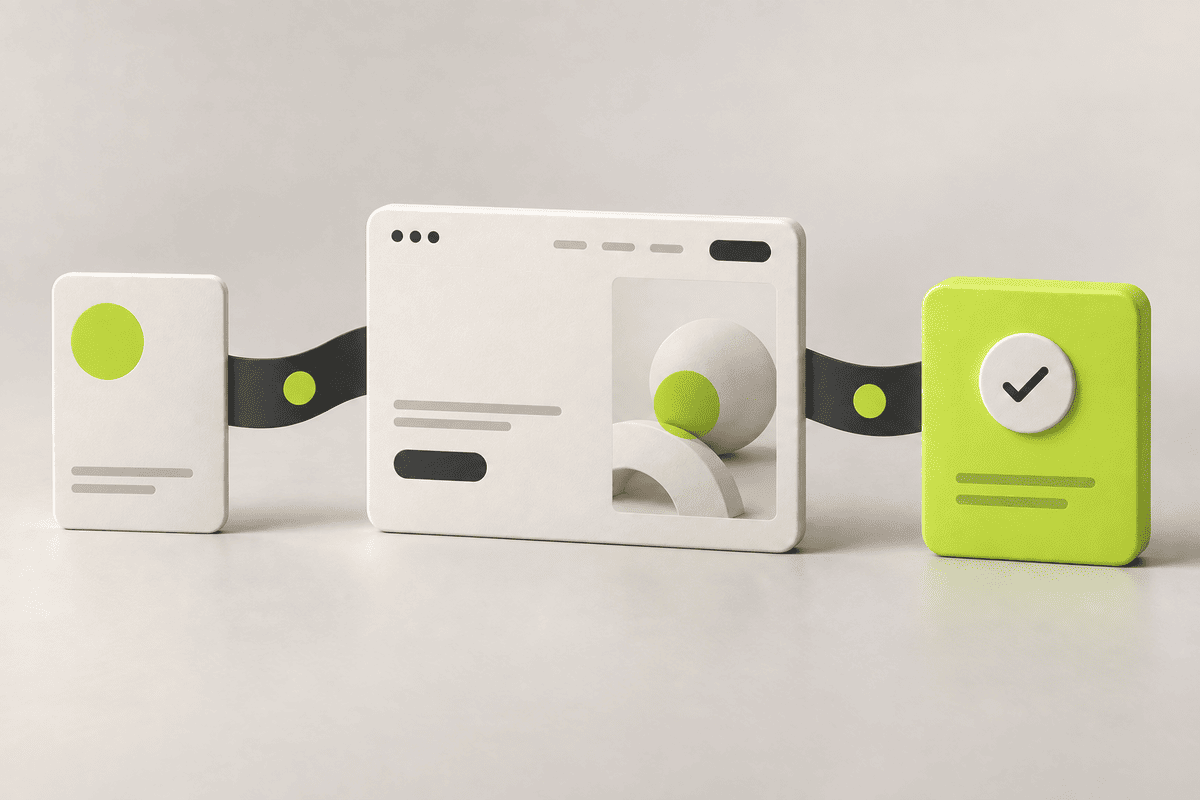
Web design
Educational
Explore all
December 8, 2025
Connect the campaign message, landing page, proof and form so visitors understand the offer and can take the intended action without confusion.
In this article
Reviewed 12 September 2026.
A campaign can attract the right visitor and still lose them on the destination page. The problem often starts when a specific promise leads to a generic company introduction. Plan the campaign and page as one continuous conversation.
Write the promise before arranging sections
Collect the exact wording of the ad, email or referral message that brings visitors to the page. Identify the audience, offer and expected action. Put those elements into a short campaign statement that the team can use when reviewing the design.
For a hypothetical school operations platform, a campaign about scheduling should lead with scheduling. The page can introduce broader capabilities later, once the visitor recognises the promised subject. A strong visual identity helps, but it cannot compensate for an opening that appears to answer a different question.
Build a sequence of buyer questions
After the opening, explain the problem, show the relevant capability, provide evidence and describe the next step. The order should fit the audience’s familiarity. A reader who already knows the product may need implementation details sooner than a first-time visitor.
Draft section headings before body copy. Read them as a sequence and check whether they tell a coherent story. Remove headings that merely announce Features or Benefits without helping the reader understand the point. Specific headings also make the page easier to scan during a quick evaluation.
A hypothetical scheduling campaign from promise to actionTouchpointMessage to preserveCheckCampaignSimpler scheduling for school teamsAudience and task are explicitPage openingSee the scheduling workflowHeading matches the campaignProofA relevant workflow exampleExample is labelled accuratelyConfirmationWhat the demonstration coversDelivery and follow-up work
Choose proof that fits this campaign
Use a demonstration, screenshot or customer example that supports the offer on this page. An impressive result from an unrelated service may attract attention while leaving the actual buying question unresolved. Label illustrative examples so they cannot be mistaken for client outcomes.
If the page invites a demo, describe what the demo covers. If it offers a downloadable guide, show what the guide contains. This small preview helps visitors assess the value of the action and reduces the gap between the marketing promise and the experience after conversion.
Inspect the route after the button
A form submission is part of the journey. Confirm that the thank-you message explains what happens next and that the delivery process works. Test links in follow-up material and verify that the team receiving the enquiry has enough context to respond.
Record campaign names consistently so you can distinguish traffic sources later. Review the quality of resulting conversations alongside the number of submissions. A page that attracts more requests outside your target audience may need a clearer fit statement, even when its raw conversion rate appears stronger.
Every step after a campaign click should make the original promise more concrete.
A related YAVACADO project

For Learning Hub, YAVACADO designed and developed a Webflow landing page with CMS content and custom interactive elements. The project is a useful example of presenting an education platform through a focused website experience.
View project: Learning Hub - Inetgra
Check your own website
Your review checklistCompare the campaign and page headingsUse proof relevant to the offerExplain what the action deliversSubmit a full test enquiryUse these checks as you review. Selections are not saved.
Put it into practice
An ad promises a migration checklist, but the page asks visitors to book a sales call. How would you fix it?
Show the suggested approach
Deliver the checklist through the primary action the campaign promised. A consultation can be an optional next step with its own explanation. Alternatively, change the campaign so that it clearly offers a consultation from the beginning.
Continue reading
Website First Impressions: Design for Clarity, Trust and the Next Step
References
Discuss your website
Bring your current website and the task you want to improve. YAVACADO can help define the content, design and implementation work needed for the next step.
FAQs
Should a landing page remove all navigation?
Can several campaigns use one page?
Which conversion should we track?
A Webflow Performance Audit: Find the Cause Before Changing the Page
12/22/25
4
min to read
Build a Multilingual Webflow Website: Content, Routing and Launch Checks
10/25/25
4
min to read
From AI Website Concept to Production: What Still Needs to Be Built
4/9/24
4
min to read
How to Structure a Service Page for Qualified Enquiries
11/24/25
4
min to read
Relevant project
SEO-Optimised Landing Page for an Education Platform
Other
Integra needed a centralized platform to streamline school operations, integrating marketing, sales, scheduling, and analytics within ClickUp for enhanced efficiency.
Learning Hub - Inetgra


LET’S WORK TOGETHER
LET’S WORK TOGETHER
LET’S WORK TOGETHER
LET’S WORK TOGETHER
LET’S WORK TOGETHER
LET’S WORK TOGETHER
LET’S WORK TOGETHER
LET’S WORK TOGETHER
Testimonials
What our clients say
A web design agency that cares about you and your brand, no matter the size or what industry your business is in.

YAVACADO turned a complex booking process into one clear platform. Our team can manage tours and content in Webflow, while parents can book and pay securely through WayForPay. The result is easy to operate and built around the needs of the Ukrainian market.

The website captures the premium feel of our brand perfectly. From the design to the multilingual functionality and payment integration, every detail was delivered to a very high standard.

Excellent implementation of our Figma design in Webflow. The final website feels fast, polished, and exactly aligned with the premium fintech experience we wanted.

The funnel feels significantly more polished than the original concepts and was delivered in a format our internal team could immediately continue working with. Smooth process and excellent execution.

Working with YAVACADO was a fantastic experience. They understood both the technical requirements and the business goals, delivering a fast, polished website that's easy to manage and built to generate qualified leads.

Impressive speed and quality. The landing page was delivered in just hours and looks clean, professional, and ready to use.

The turnaround was incredibly fast, and the result looks clean and professional. The site reflects our firm perfectly and was delivered exactly on time.

The YAVACADO team helped us present FromLab2Jab’s complex services in a clear and professional way. The structure, CMS, and filtering system make it easy for our team to manage and scale the content.

The final website matched the Figma design with impressive accuracy. The animations, sticky sections, and overall Webflow execution made the project feel polished and high-end.

YAVACADO delivered a powerful, scalable platform that fully supports our operations. The CMS structure, CRM integrations, and automation tools significantly improved how we manage inquiries and camp programs.

The phased design and development approach made everything clear and efficient. The team delivered a professional SaaS website on time, and the training support helped us manage content confidently

The platform works exactly as we envisioned — secure, structured, and scalable. Subscription management and report access are fully automated, and everything runs smoothly.

The Webflow build perfectly matches the AI design and feels even better in motion. Everything from CMS to animations works smoothly—great work!

The redesign gave our website a completely new look. The layouts feel modern, the services are presented much clearer, and the site works perfectly on mobile.

The redesign elevated our corporate presence and made content much easier to manage. The Feensweet filtering and CRM integration streamlined our user experience and lead flow — great implementation!


